A New Look for the Quaint Oak Family of Companies
As the future of banking evolves and technology advances, it’s important for financial institutions to provide their customers with access to high-tech tools and forward-thinking banking features. That’s why Quaint Oak Bank is proud to announce our rebranding initiative, emphasizing our position as a modern, innovative, and digital-first organization delivering ground-breaking products to our customers.
Our new custom-built websites, logo design, and brand elements are a visual representation of our growth and focus on the future. Quaint Oak’s goal is to provide the best financial services possible, and we believe that our new look encompasses the unique experience we offer our customers.
Serving You Now by Evolving for Tomorrow
At every stage of the rebranding process, from the selection of our web development company, to choosing a color palette, our team focused on accessibility. Primarily, our intention was to create a digital experience that all customers can successfully operate.
“We’re excited about the future of our Family of Companies,” says William Gonzalez, Executive Vice President and Chief Operating Officer at Quaint Oak Bank. “We’re constantly looking for ways to improve our offerings, as well as provide our customers with relevant and meaningful financial products. As a bank with over 95 years of history, but also one who prioritizes progressive technology, this rebranding is just one of the ways we’re showcasing the heart of our business.”
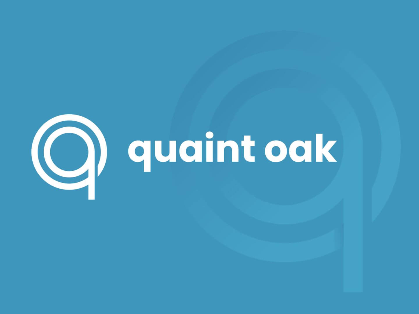
“Our new logo features a sleek, modern design incorporating the Q and O of Quaint Oak. Interlocked within a circular design, it represents our interconnected services fostering limitless potential and a deeply rooted establishment flourishing in modernity, while strengthening ourselves and our customers within the digital space,” says Aimee Ott, Executive Vice President at Quaint Oak Bank. “We want our customers to know that Quaint Oak is always looking for ways to improve and adapt while maintaining our customer-centered and compliant culture.”
Accessible. Reliable. Knowledgeable.
Quaint Oak’s new color scheme includes vibrant shades of cyan blue that represent trust, knowledge, accessibility, and reliability. This color is complemented by a secondary yellow palette that represents our bright future, continued progression, and sense of community. Together, our colors create a strong visual identity that is friendly and open, yet professional and modern.
“Overall, our rebranding is an exciting step forward for our company,” says Robert T. Strong, Quaint Oak Bank’s President and CEO. “We will continue providing the best possible financial services to our customers, and believe that our new look reflects our dedication and devotion to constantly serve and evolve.”
As we move to the future, we will continue to look for ways to develop and grow, always keeping our customers’ needs at the forefront of our decisions. We’re excited about the future of Quaint Oak, and to take our customers on this journey with us.
Contact Us Today!

